This is my second post about the visual appearance of U.S. newspapers, actually a continuation to my previous post which was mainly about New York Times. To read the whole story, start from “Newspapers of the USA. #1” also available on this very blog.
I took a task of observing how four different U.S. newspapers look at the same date (3rd of October), and what we can learn from that.
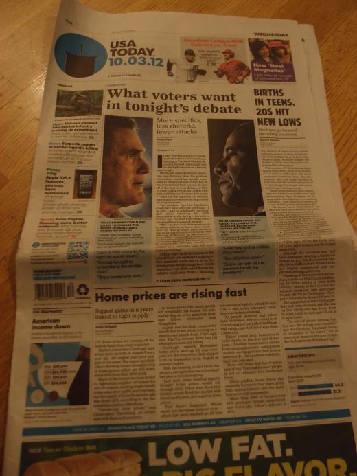 Second paper in my sample, USA Today, is very different from New York Times. The paper was launched only 30 years ago, a history very short compared to the 161-year old existence of NYT. When it was founded, it “revolutionized newspapers with splashy color photos and info graphics” in the United States, according to a story in U.S. tabloid New York Post.
In September 2012, just a month ago, the paper had the largest visual redesign in it’s history. That “facelift” added even more color, photos and information graphics to the paper.
USA Today has completely different design principles compared to NYT. The front page is well structured and colorful. It is easy to instantly understand which of the stories is the leading news. The main headline is also easy to grasp: “What voters want in tonight’s debate”. Compare that to the NYT headline: “Stark Backdrop as President Prepares to Debate.” Excuse my French – and non-native English – but what the f- effing crap is “Stark Backdrop” and why should I care?
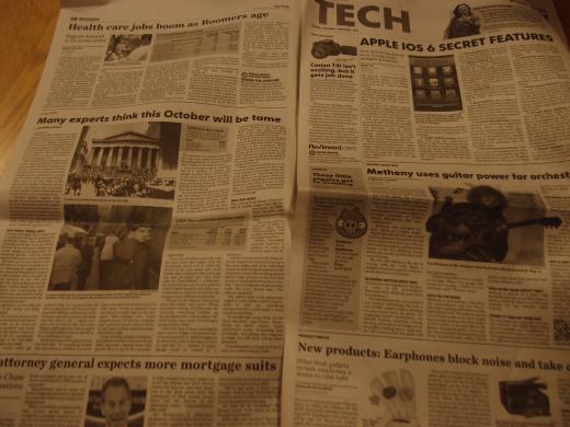
Bright colors are used liberally to differentiate the segments (News, Money, Sports, etc) in the front page. Photographs are very conspicuous. All in all, the first impression is very in-your-face. Inside the paper there is less color, but headlines are throughout larger than in NYT and stories are generally split in smaller parts. It is easier for the reader to nibble here and there and choose what portion of the offering to engulf.
Attention is even paid to tiny details. The new main logo – color circle at the top – contains a vignette picture which is changed every day to reflect the news day. In October 3rd, the date of presidential debate, it was a silhouette of podium and microphone.
All in all, USA Today seems modern and easy to grasp in the first glance. (It is worth noting that it is not a tabloid – those papers are yet significantly more colorful and hyperactive.) But USA Today also needs to woo readers, because I have understood that the paper is going downhill.
And the colorful design leaves me in doubt. I like contrast, hierarchy, clarity and strong visual representation. But I have to admit it also feels a bit cheap, even desperate. If you have to use that much color, how is your content? Is it informative and nutritious? At least in a grocery store the general rule is: crappier the granola, more colorful the box. I might find USA Today easy to read, but I’m not sure if I find if easy to believe.
(My newspaper Helsingin Sanomat is switching from broadsheet to tabloid in the start of 2013. Looking at USA Today, I hope we understand how important is it to look respectable. The change in size is a significant change for readers, and they should feel that the new paper is continuing the old tradition.)
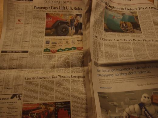
USA Today once had a biggest circulation of U.S. newspapers, but it has lost that position to The Wall Street Journal. That is a third paper in the sample, and only paper in full color outside and inside.
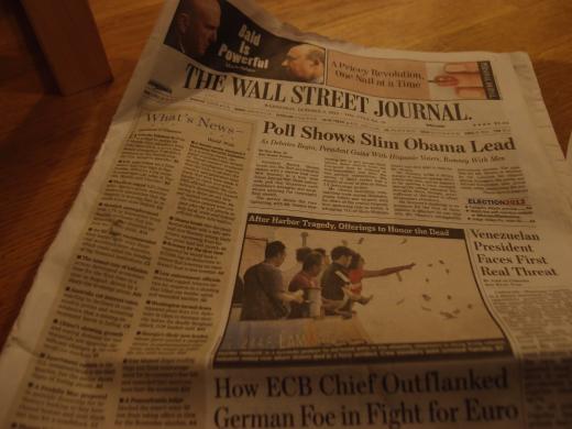
Wall Street Journal was traditionally strictly about the economic news. But Rupert Murdoch, who bought the paper in 2007, wanted to broaden it’s focus on more general news. Today it is indeed a viable competitor to general papers such as New York Times and USA Today. It is still economy-heavy, which is understandable because that is the traditional strength of the paper. But it also seems more fresh and readable than New York Times in many ways.
Despite the full-color, WSJ still has an impression of very serious paper. There is a lot of text. Boredom might strike a tired reader waddling through the pages. But there are also helpful things, like information graphics with a lot of thought here and there. Pictures also look nicer than in NYT because of color. And the lighter end of the October 3rd paper, “Home & Digital” section, could be even considered vivid and fresh-looking.
Wall Street Journal is financially not doing bad, considering the circumstances, I have understood. It also has a clear niche that is very fruitful: it is a serious, respectable right-wing newspaper. It is considered conservative, but it is not out outrageously partisan and republican in its views like the news channel Fox. There seems to be an abundance of prestigious left-leaning papers, but right-leaners with a strong national reputation are more rare. That is at least my impression based on my short time in the country.
(If you don’t mind, I will skip the fourth paper, Los Angeles Times, in this comparison since I kind of feel I should wrap this up and not write too long a post.)
I spent nine weeks in U.S. reading national and local newspapers. All in all, they seem quite traditional compared to Finnish papers. Stories are longer and they still have jumps (Continues in page X) maybe because of that. In the first post of this twin-narrative I said that our newspaper has almost an obsession to visual appeal. After spending most of my career inside that obsession, it was really eye-opening to read U.S. newspapers which are very traditional when it comes to form, and had somewhat backwater-feel in their design and general appeal.
On the other hand, I really liked the stories in U.S. papers. They were often lot more thorough once you went ahead and actually read the story. Sometimes stories in Finnish newspapers seem way too short and anecdotal. And sometimes I’m really envious to internet bloggers who have no physical constraints of paper and can really dive deep (and in length) into their topic of choice, provided they have the competence to do it.
Turbulent times ahead of our industry will tell whether their approach is right, or ours. Or whether both are right in those two different media markets.
Sources: