 She is smart, but she also needs the looks. Right?
We have traveled around the USA for eight weeks and visited almost a dozen newspaper newsrooms, among other things. I’m going to write a couple of posts about U.S. newspapers, based on my observations. First two will be about the visual appearance and design of the papers (just one narrative, but split in half). Third will be about “survival stories” of media in turbulent times.
So, here it comes, the first one.
Does beauty matter? When it comes to U.S. media, clearly not, since the one thing we have NOT talked about during our grand tour is an overall appearance of a newspaper.
I mean this literally: we have not talked about it at all.
Not during a single visit have our hosts chosen to say ANYTHING about what they do to make the paper look appealing and readable. I asked some questions about it, but all in all, U.S. newspapers just don’t seem to consider it that important an issue – even when talking about the newspaper with media professionals.
In Helsingin Sanomat, we put a lot of effort to look appealing and interesting. We think that makes our readers actually read the stories and be committed to the paper.
It is often hard with Business section, where I work, and that’s why we try even harder. Sometimes I spend hours and hours copywriting graphs and visualizations, and we go lengths to try to come up with good picture ideas for stories that have nothing visual to begin with. We have also recently created several important new posts for visual design and made a few high-profile hirings to fill them up. If the paper looks good, we get praise from our editors, and if not, we get nags.
But U.S. papers have different values. They look traditional and old-fashioned compared to Finnish papers.
Is it good or bad thing? More about that in my next post. First, let’s take a look at four large U.S. newspapers – New York Times, USA Today, Los Angeles Times and Wall Street Journal – in the same day. I have chosen 3rd of October as a reference. This was a date of the first presidential election debate of Barack Obama and Mitt Romney. All the papers had a story about what to expect from the debate in front page. Other news varied.
 I will start with The New York Times, which is often considered the best U.S. newspaper, or the “newspaper of record” for things to happen.
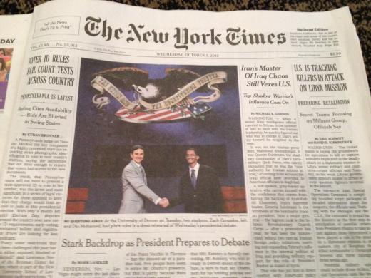
The paper is often called “Old Gray Lady”, and looking at the front page, the nickname seems justified. This is not a compliment. The front page is awful. Just horrible. With all due respect: NYT is one of the best newspapers in the world, having hundreds of great journalists, lot of great writing and network of correspondents all over the world, but it’s front page is seriously outdated.
The general appearance is gray and textual, which could be justified, NYT being a paper of serious thought.
But there are more fundamental problems. The front page should reflect the news hierarchy: what the paper thinks are most important stories for the day, and how important they are related to each other. That’s the way modern newspapers work. When a hurried reader looks at the paper, he should instantly get a sense of how humankind is doing right now. One story should clearly stand out above the rest.
NYT fails to do that. On top of the front page there are three exactly equal-size stories, with a headline exactly as large. Or, to be precise, as small. One of these stories:
1) a news story about Libya ambassador killer hunt
2) a really ambivalent story about Iran and Iraq which topic is actually hard to grasp
3) a national news story of a quarrel about what kind of ID people need to vote for a president in November
…is the main story, but god knows which one.
Between these stories is a picture reportage from Henderson, Nevada, where president Obama is preparing for the debate. The story is about those preparations. Reporter is on the scene and begins his story with a lengthy description of the lakeside resort by Lake Las Vegas. But the picture has nothing to do with Nevada. It is an unrelated picture of a dress rehearsal of the debate, taking place in Denver. This might seem like a minor detail, but it is such a basic design flaw. The layout does not convey the impression of actually being on the set, which is the point of reportages like this. Looking at the story, I did not feel like reading it.
So why is New York Times, a newspaper run by extremely talented professionals, like this?
Because they choose to. We visited the NYT newsroom in September, and the editor folks explained us that the front page of New York Times is an extremely conservative institution. (He also seemed to think that the front page actually looks good and works well, but I beg to differ.) Readers have strong expectations about the paper with a strong tradition. The old-fashioned front page evokes an impression of traditional quality journalism. That is why they let it be. With it, they stand out of the pack. The individual sections like Business and Art actually have much better and more modern front pages, so it’s not that the paper lacks visual talent.
NYT does relatively well compared to most other newspapers in the U.S. It is the most expensive newspaper in U.S. – weekend edition costs 5 dollars – but people are willing to pay the price. The paper does not have to woo readers as hard as some other newspapers.
When you are such an institution, you don’t have to try that hard to woo readers. But the other three papers look very different – especially the USA Today. More about that in my next post.